Loading the data
This post revisits an older Tidy Tuesday dataset, it is concerned with capacity and costs for solar and wind energy.
Show the code
pacman::p_load(tidyverse)
capacity <- readr::read_csv('https://raw.githubusercontent.com/rfordatascience/tidytuesday/master/data/2022/2022-05-03/capacity.csv')
wind <- readr::read_csv('https://raw.githubusercontent.com/rfordatascience/tidytuesday/master/data/2022/2022-05-03/wind.csv')
solar <- readr::read_csv('https://raw.githubusercontent.com/rfordatascience/tidytuesday/master/data/2022/2022-05-03/solar.csv')
average_cost <- readr::read_csv('https://raw.githubusercontent.com/rfordatascience/tidytuesday/master/data/2022/2022-05-03/average_cost.csv')
Cleaning the data
Let’s take a look at the average cost data:
Show the code
average_cost %>%
  head(5)
# A tibble: 5 × 4
year gas_mwh solar_mwh wind_mwh
<dbl> <dbl> <dbl> <dbl>
1 2009 57.6 168. 74.3
2 2010 56.8 140. 65.5
3 2011 46.0 111. 47.8
4 2012 44.5 84.1 40.1
5 2013 43.2 68.9 28.7
In order to make visualisation easier we are going to convert the data into long format, using the pivot_longer function:
Show the code
average_cost %>% pivot_longer(cols = gas_mwh:wind_mwh,names_to = "type",values_to = "cost") %>%  mutate(flag = if_else(type == 'solar_mwh', 'top', false = 'bottom')) -> average_cost #Assign to a new variable

average_cost %>%
  select(-flag)
# A tibble: 39 × 3
year type cost
<dbl> <chr> <dbl>
1 2009 gas_mwh 57.6
2 2009 solar_mwh 168.
3 2009 wind_mwh 74.3
4 2010 gas_mwh 56.8
5 2010 solar_mwh 140.
6 2010 wind_mwh 65.5
7 2011 gas_mwh 46.0
8 2011 solar_mwh 111.
9 2011 wind_mwh 47.8
10 2012 gas_mwh 44.5
# ℹ 29 more rows
The wrangled data is now far more suitable for visualisation.
Visualise the data
Let’s visualise the data looking at the costs over time for each of the energy sources.
Show the code
average_cost %>% ggplot(aes(year,cost,color=type))+
  geom_line(aes(linetype=flag), size=1.5,alpha =0.8)+
  scale_x_continuous(breaks = seq(2008, 2022, by = 2))+
  scale_y_continuous(labels = scales::dollar_format(), breaks = seq(0,175,by=25))+
  tidyquant::theme_tq()+
  expand_limits(y=0)+
  guides(linetype="none")+
  scale_linetype_manual(values = c("dashed","solid"))+
  labs(
    x="",
    y="Cost",
    title = "Energy costs over the years",
    subtitle = "Solar has experienced the most drastic decrease in costs",
    caption = "Data from Tidy Tuesday: 04-05-2022")+
    tidyquant::theme_tq()+
    tidyquant::scale_color_tq()+
    theme(legend.title = element_blank()) -> plot1

plot1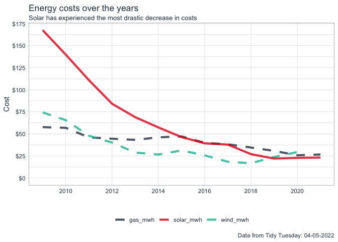
We can see that in solar has experienced the most drastic decrease in costs for the available date ranges in the data. Let’s get a sense of the spread of the prices for solar:
Show the code
solar %>%
  ggplot(
    aes(solar_mwh)
  )+
  geom_histogram(color = 'white',
                 fill ='midnightblue')+
  geom_rug()+
  labs(
    title = "Distribution of price for solar",
    x = "",
    y= "Count"
  ) +
  scale_x_continuous(labels = scales::dollar_format(suffix = "/MWh")) +
  # scale_y_continuous(expand = c(0,0), limits = c(0,50))+
  tidyquant::theme_tq() -> plot2

plot2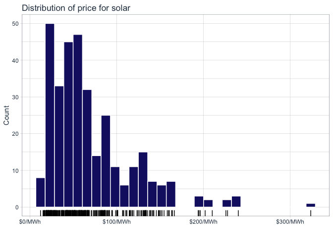
The prices for solar energy vary from 12/MWh to just above 300/MWh, the majority between 12 and 100. Let’s also try to understand the relation ship between $/MWh and solar capacity.
Show the code
solar %>%
  ggplot(aes(solar_capacity,solar_mwh, color=solar_capacity))+
  geom_jitter()+
  geom_smooth(color='midnightblue')+
  tidyquant::theme_tq()+
  theme(legend.position = "none")+
  scale_color_continuous(name = 'Wind Capacity') +
  scale_y_continuous(labels = scales::dollar_format(suffix = "/MWh"))+
  labs(
    x="Solar Capacity",
    y="Solar Projected Price",
    title = "Relationship between solar\nprojected price and capacity") -> plot3

plot3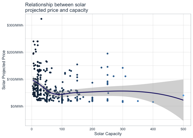
The relationship is not too strong, but at an overall level we can say that the price decreases as solar capacity increases, up to a certain point where it seems to stabilise.
Bring it all together
Let’s bring all of these visualisations together using the patchwork package:
Show the code
library(patchwork)
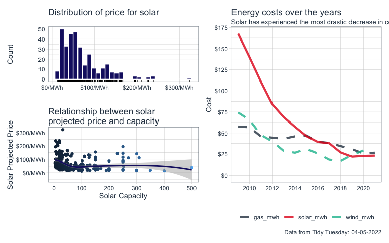
((plot2/plot3|plot1))